
App Onboarding: The 5 Elements That Win the Subscription
Across 115,000 apps, trial starts cluster almost entirely on Day 0, the same session someone installs, from 78% in Productivity to 89.9% in Business, and roughly half of all paid conversions happen that first day too (RevenueCat, State of Subscription Apps 2026). Whatever your onboarding is going to do, it does almost all of it in the first session. Onboarding is not the warm-up to the funnel. It is the funnel.
Which is exactly why the most common onboarding advice is so dangerous. Add more value, show every feature, make sure they see everything the app can do. That advice is the mistake. App onboarding is not a tour of your features. It is the shortest path from install to the moment someone understands why they downloaded the app, and every screen that does not serve that moment is costing you a subscriber.
Those first screens carry your entire conversion engine. Most teams build them last, after the product, after the paywall, after the pricing debate. By the end of this piece you will know the five elements every onboarding must contain, why "add more value" quietly backfires, and why the screen right before the paywall is the one that decides whether they buy.
Why "add more value" quietly kills conversion
App onboarding fails when it shows too much to remember, not too little. This is the counterintuitive part, and it comes down to how memory actually works.
Working memory holds only a handful of items at once. Modern cognitive research puts the number around three to four chunks. As a user moves through your onboarding, every new benefit you show starts overwriting the one before it. Screen seven pushes out screen four. The tenth feature erases the third.
So by the time a user reaches the paywall, they are not weighing your price against the ten values you presented. They are weighing it against the two or three they still remember. That is their perceived value. If perceived value is greater than the price, they subscribe. If it is less, they leave.
Be precise about what the problem is, and what it is not. It is not that long onboarding is bad. Plenty of long flows convert beautifully, and plenty of short ones fail. The enemy is not length, it is forgettable screens and decision fatigue. Whether your flow is four screens or forty, only what survives in the user's memory actually reaches the price.
Credit for this framing goes to Ihar Koshaleu, whose LinkedIn post captured it in one diagram: more value, less remembered. The more you show, the less survives to the moment that matters.
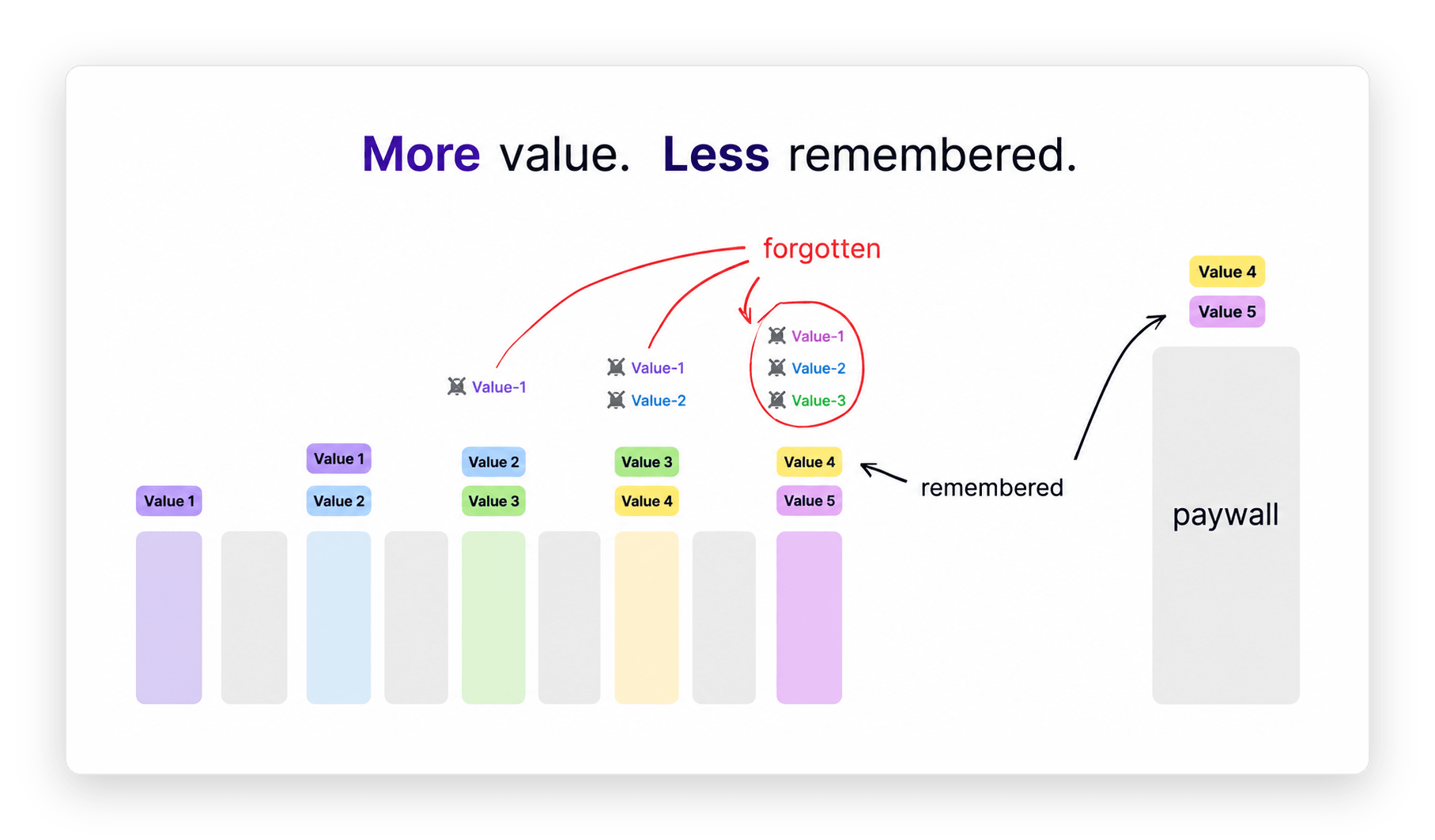
Reference: Ihar Koshaleu's Post
The one screen most teams have never built
Here is the fix, and it is simpler than any redesign: right before the paywall, add a single screen that brings all the value back together. A recap that reloads everything into the user's working memory before they see the price.
A value-recap screen is a summary slide placed immediately before the paywall that restates an app's core benefits in one view, reloading them into the user's memory at the exact moment perceived value is compared against price.
If you have designed paywalls before, this sits right next to a pattern you already know: the three-screen paywall, where you show what they get, then the proof, then the price, instead of dropping all three onto one crowded screen. The recap is that same logic pulled one step earlier, into onboarding, and tailored to the answers the user just gave you.
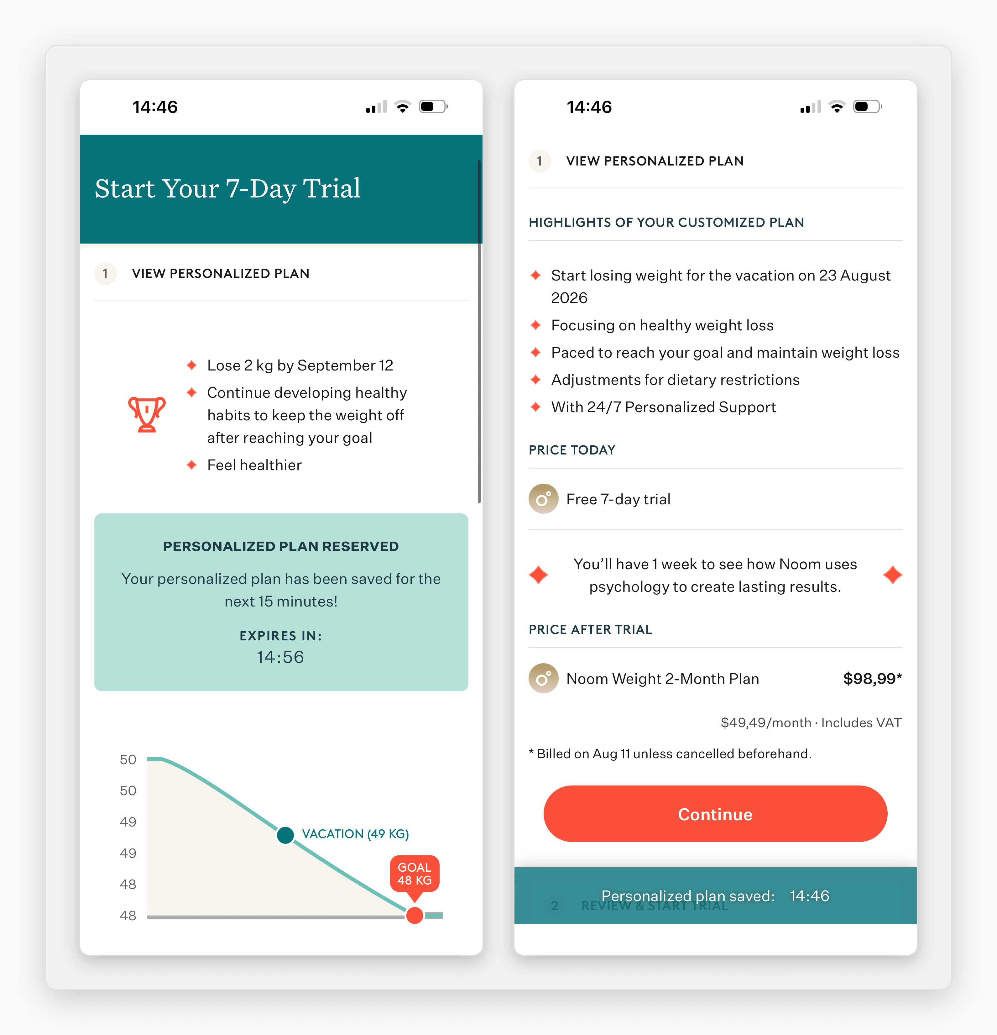
Apple does this with iPhones. Scroll any iPhone product page and you will hit a final slide, right before the price, that gathers the biggest features into one summary, just to remind you why it costs what it costs. That is not decoration. It is a memory reload placed at the decision point, and it is the highest-leverage change most app teams have never made.
The five elements every onboarding needs
These are elements, not a screen count. Your flow might be four screens or forty. What matters is that each of these five jobs gets done, in this order. You can spread them across as many screens as your app needs.
Element 1: The outcome hook. Name why they downloaded the app. Lead with the result they came for, not your logo, your mission statement, or a feature list. This is where time-to-value starts. If the value is not evident in the first minute, you are already bleeding users who will never reach the paywall. A budgeting app opens on "know exactly what you can spend today," not on a carousel of account-linking features.
Element 2: Personalize. Ask the one intent or goal question that makes the promise theirs. Blinkist asks what you want to achieve before it shows you anything. Duolingo asks why you are learning. This is not data collection. It is the single biggest lift in modern onboarding, because the moment a user tells you their goal, the rest of the flow stops being about your app and starts being about them.
Element: The quick win. Deliver a taste of the value before you ask for anything. Duolingo drops you straight into a lesson and shows you a streak before it ever mentions signup. That is deliberate. Delaying account creation and permission requests until after the aha moment cuts friction exactly where drop-off is highest. Let them feel the win first; ask for the email second.
Element 4: The value build. Now stack your benefits, but only the strongest two or three, not ten. You already know most of what you show will be forgotten, so this screen is a decision, not a dump: which two or three benefits do you want surviving in memory when the price appears? Fintech flows like Monzo, Robinhood, and Revolut do this well, framing a small number of concrete outcomes rather than reciting every capability.
Element 5: The recap into the paywall. This is the memory reload from Screen 3's logic, made explicit: gather the core value back together, then show the price. This is where perceived value is decided. Get this screen wrong and every good thing you did in the first four screens has already faded.
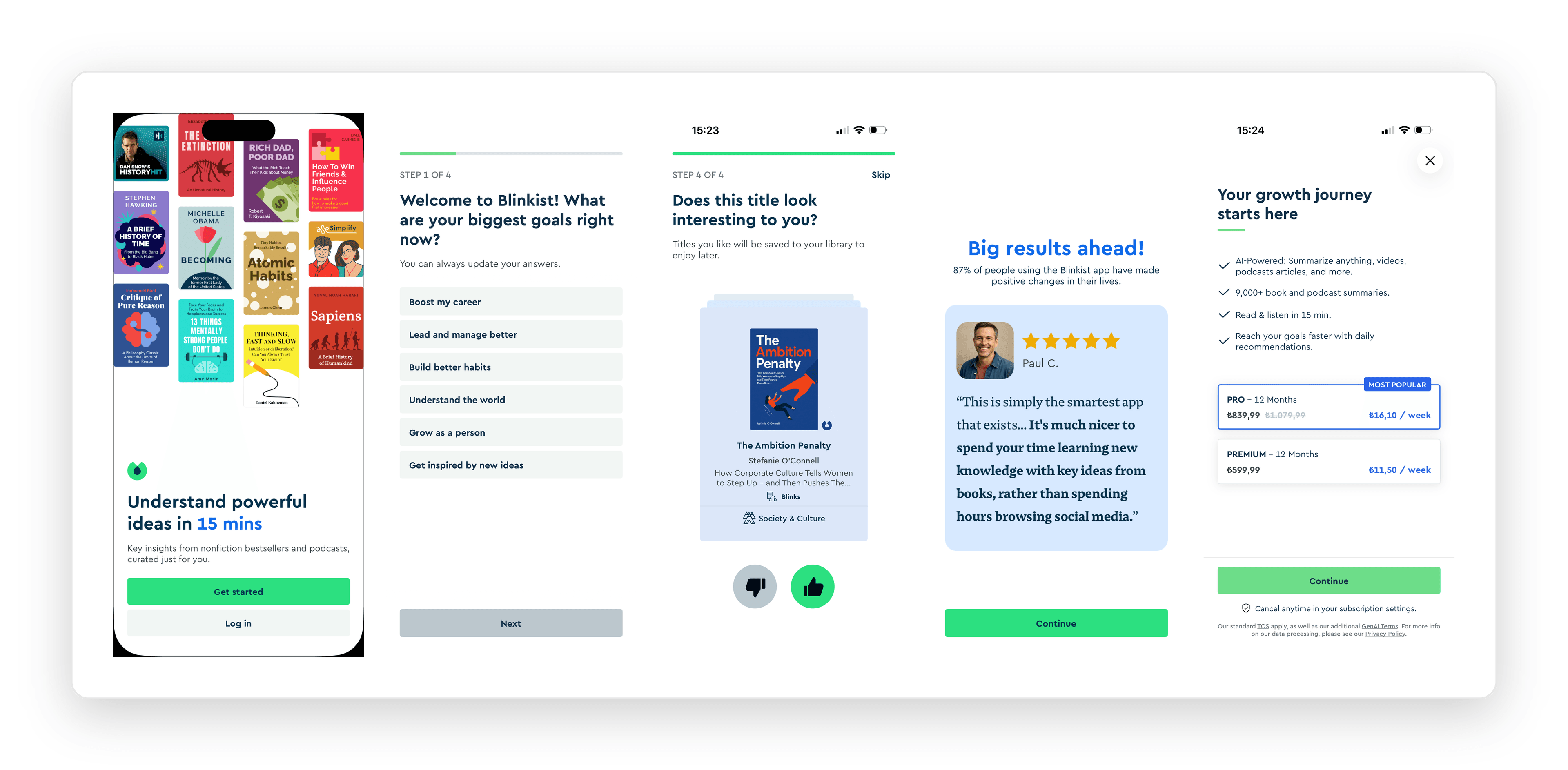
That order is not decoration either. With roughly 82% of trials starting in that very first session, this sequence is built for the one visit you actually get, not the tenth.
The onboarding rules that survive contact with the paywall
- Value, not features. Lead with outcomes. Features are what the app has; value is what the user gets.
- Progressive, not a tour. Give one real win. Do not walk them through every screen you built.
- Delay signup and permissions. Ask after the aha, not before.
- Personalize with a smart question. One goal question reframes the entire flow around the user.
- Interactive beats passive. A user who does something remembers more than one who watches.
Then measure the two numbers that actually predict revenue: time-to-value (how fast a new user reaches the moment the app pays off) and the Day 1 to Day 2 return, where most cohorts quietly fall off before they ever see a second session.
This kind of pre-paywall and post-paywall sequencing, tested screen by screen, is the sort of thing we are building OWA AI's measurement layer to run. But you do not need us to start. The recap screen is a change you can ship this week.
FAQ
What is app onboarding?
App onboarding is the sequence of screens a user sees immediately after installing a mobile app, designed to take them from install to the moment they understand the app's core value. Its job is not to demonstrate every feature but to reach that value moment as fast as possible, because in subscription apps the onboarding flow is where most first-session conversions are won or lost.
How many onboarding screens should a mobile app have?
There is no fixed number, and chasing one misses the point. What matters is that five jobs get done in sequence: hook on the outcome, personalize with a goal question, deliver a quick win, build the two or three strongest benefits, then recap into the paywall. That might take four screens or seven. Fewer screens that each do a job beat more screens that each add a forgettable feature.
Why do users drop off during onboarding?
Two reasons dominate. First, value arrives too slowly, so users quit before the app pays off. Second, onboarding shows too much, so by the time users reach the paywall they remember only two or three weak benefits, not enough to justify the price. Long, feature-heavy flows make both problems worse.
What is a value-recap screen and where does it go?
A value-recap screen restates an app's strongest benefits in a single view, placed immediately before the paywall. It works because working memory holds only three to four items, so the benefits shown early in onboarding fade before the price appears. The recap reloads them at the exact moment perceived value is compared against cost, which is why Apple ends its iPhone pages on a feature summary right before showing price.
The audit worth running today
Onboarding is a memory game played against the paywall. You are not trying to maximize value shown. You are trying to maximize value remembered at the moment of price.
So do the audit. Open your own paywall screen and ask, honestly, what a first-time user actually remembers by the time they land there. If the answer is two weak things, that is your leak. And the recap screen is the fix.
If you would rather not run it alone, that is what we do. Book a call and we will walk your onboarding and paywall with you, screen by screen, and find where the value leaks before the price.